Monday, 30 May 2011, 12:54am
Website Redesign! Earlier this weekend while working on various projects I had the thought that my website was looking a little out of date and never really had the right design for my tastes. After spending a few minutes looking through WordPress.org’s extensive theme collection, I came across one that was designed by a developer in Sweden. The theme is called “The Common Blog” and had most of the elements I was looking for my site and figured I could add any element(s) that were missing.
After downloading the files and exploring the theme on my test server I was able to make some changes to the theme to meet my needs. Some of the core strengths that attracted me to this theme were the open spaces and larger fonts. It seems cleaner and easier to read. My previous theme also had a large variety of different colors that I found distracting to my photographs. This redesign has me going in the right direction but there are still lots of little details that I haven’t tested or investigated.
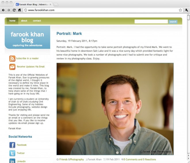
This a screen shot of my website that I captured a few months ago:
It is a little sad to see that old design going away. Luckily I still have all the files and if I ever want to revive it, the process would take a few minutes because I have all the source information.
Feel free to let me know what you think of the redesign and if there is anything that seems broken. I like to think of websites as complex machines that have many bells, levers and controls and changing any one can make or break the system. Enjoy!
